Every October I get the same urge to repaint something, and honestly, the walls are the fastest way I know to make a house feel like fall. These are the ten warm shades I keep recommending to friends, because they actually work in real rooms with real lighting.
1. Butterscotch
I painted the hallway corner by the back door butterscotch last fall, and it changed how the whole entry felt. It is the color of warm toast, soft and golden, and it glows under evening lamplight. My sister laughed when she saw it because she said it looked like caramel sauce. It works best in small spaces with low natural light. Pair it with cream trim and a simple wood bench so it stays calm, not loud.
2. Terracotta
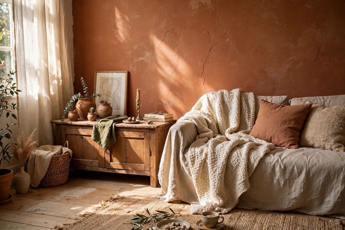
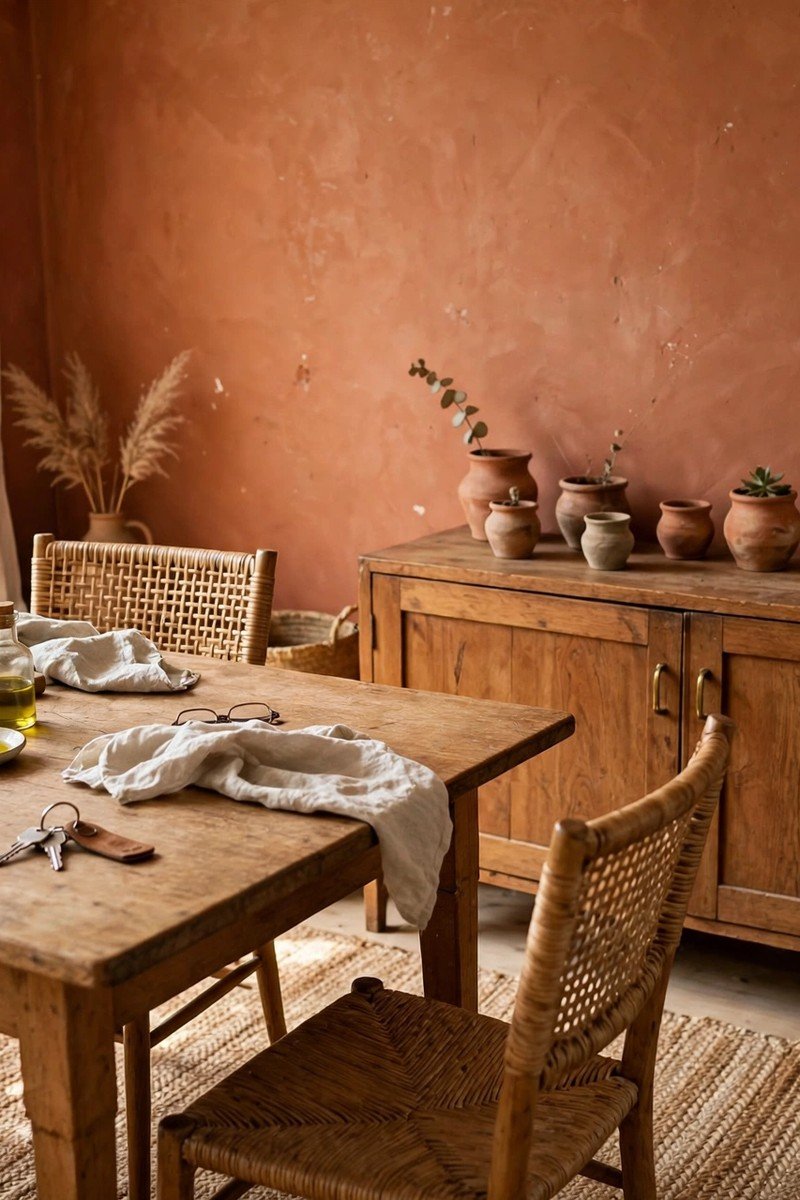
I keep coming back to terracotta because it feels like it belongs in a real home, not a showroom. My aunt has a terracotta accent wall behind her dining table, and Sunday lunches there always feel warmer than anywhere else. This color drinks up sunlight during the day and turns rich at night. It loves natural textures like jute rugs and clay pots. In a north-facing room, try a softer version so the shade does not go muddy.
3. Warm Sage
I used to think green was a spring color, but warm sage proved me wrong. It has enough yellow in it to feel like dried herbs hanging in the kitchen, which is exactly where I painted it. The corner by the stove feels calmer now, even on busy cooking days. It looks lovely next to brass handles and butcher-block counters. If your kitchen gets lots of afternoon sun, this shade will feel like golden hour all evening.
4. Burnt Sienna
Burnt sienna is bold, I will not pretend otherwise, so I used it on one wall in the bedroom and kept the rest soft white. Falling asleep next to that color feels like being wrapped in a warm blanket. It is the exact shade of the leaves piled along our sidewalk every October. It needs good lighting, so give it a warm lamp or two nearby. Dark wood furniture sits beautifully against it without looking heavy.
5. Cinnamon
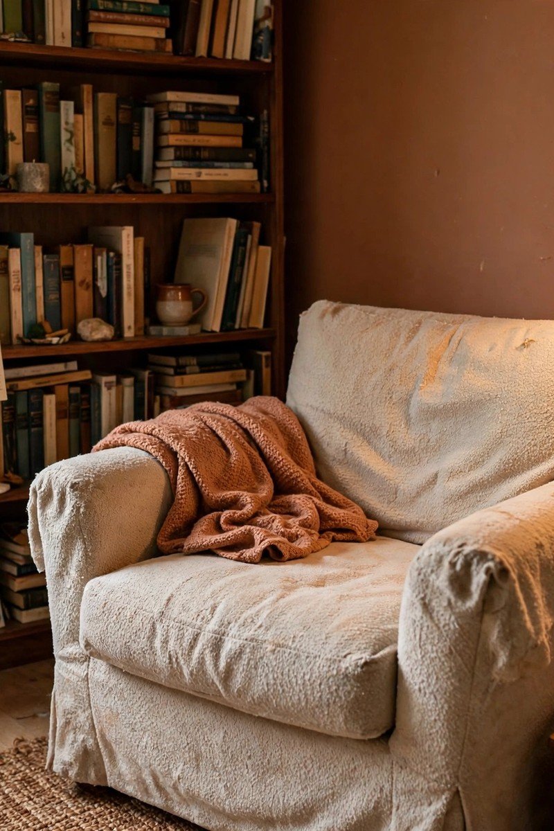
Cinnamon might be my favorite of the bunch. I painted a small reading nook this shade, just the wall behind the armchair, and now everyone fights over that seat. It has the warmth of spice without being loud, and bookshelves look wonderful against it. Natural daylight keeps it lively, but it also deepens nicely under a warm floor lamp. Try it in a study or a corner that needs a reason to sit down.
6. Golden Mustard
Golden mustard scared me a little at first because it is so cheerful. But in our small guest room, it made the space feel sunny even on gray mornings. My mom stayed over once and said the room felt like a hug, which sold me completely. Keep the bedding simple, white or oatmeal, so the walls do the talking. One warning: it can look flat under cool white bulbs, so switch to warm ones.
7. Clay Rose
Clay rose is the softest color on this list, like the inside of a seashell or an old clay pot in the sun. I used it in the bathroom, and morning routines feel gentler there somehow. It is forgiving with tile too, working with both white and gray. Candlelight or a warm vanity bulb makes it glow softly. If you want warmth without any boldness, this is the shade to start with.
8. Deep Olive
Deep olive brings the outside in, like the garden right before everything turns gold. I painted the back of a built-in bookcase this color, and suddenly the shelves had depth I did not expect. It is dark enough to feel dramatic but still warm and earthy. Pair it with brass picture lights or candles nearby. In a dim room, give it an extra lamp or it can swallow the light.
9. Toasted Almond
Toasted almond is the quiet hero of warm neutrals. It is a beige with actual personality, like the color of good bread crust. I rolled it through our living room, and the whole space felt warmer without me changing a single piece of furniture. It sits well with almost any wood tone, which makes decorating around it easy. Add texture through throws and cushions, since the color itself is calm and does not need much help.
10. Mocha Brown
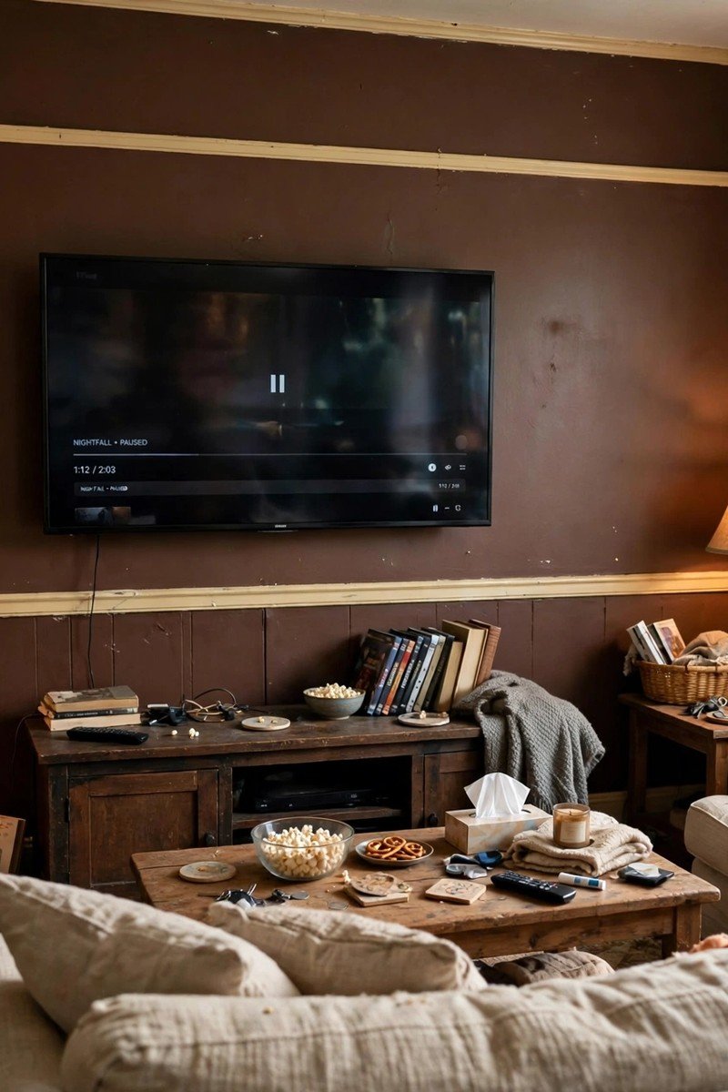
Mocha brown feels like a warm cup of coffee on a cold morning, rich and grounding. I used it on the wall behind our TV, and movie nights feel cozier than ever. Dark colors like this need breathing room, so keep the ceiling and trim light. A few warm lamps stop it from feeling cave-like. If full mocha feels like too much, try it on a wainscot or a fireplace wall first.
Conclusion
Pick the one that made you pause, and start with a single wall so you can live with it for a few days. Paint is forgiving, and fall is short, so it is worth getting the color right. I hope one of these ends up on your walls this season.