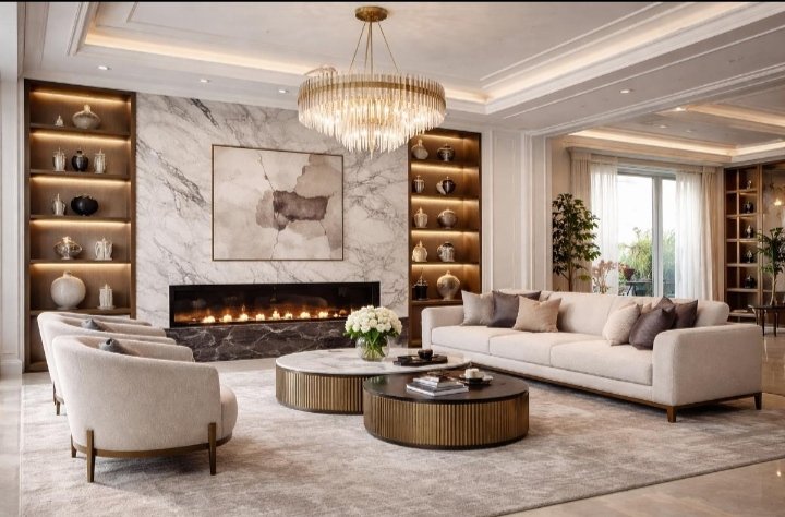
A room doesn’t need expensive furniture, designer decor, or a complete makeover to look luxurious. Sometimes, all it takes is the right color combination. The colors on your walls, furniture, curtains, and accessories can completely change how a space feels.
I’ve noticed that the most beautiful interiors often use simple, well-balanced color palettes rather than too many bold shades. Soft neutrals, rich earthy tones, and carefully chosen accents can make even an ordinary room feel elegant.
If you’re looking to give your home a more expensive appearance without spending a fortune, here are 10 color combinations worth trying.
1. Cream and Warm Beige
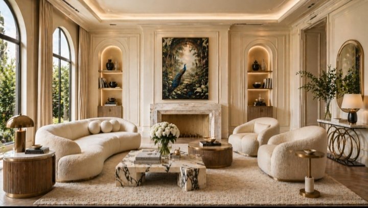
Cream and warm beige create a soft, timeless look that feels both welcoming and sophisticated. This combination works especially well in living rooms, bedrooms, and open-plan spaces.
I love how these shades make a room feel brighter without the starkness of pure white. You can use cream on the walls, beige on the sofa, and introduce natural wood through furniture.
How to use it: Pair cream walls with a beige sofa, linen curtains, and light oak furniture. Add a few textured cushions to keep the room from looking flat.
2. Sage Green and Warm White
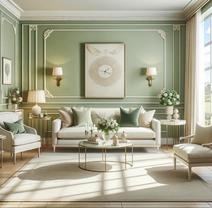
Sage green has a calming, understated beauty that makes a space feel thoughtfully decorated. When paired with warm white, it creates a fresh and elegant atmosphere.
This combination is perfect for bedrooms, kitchens, and cozy living rooms. It also works beautifully with natural materials.
How to use it: Try sage green on a feature wall, kitchen cabinets, or accent furniture. Keep the remaining walls warm white and add wooden accessories.
3. Charcoal Gray and Soft Ivory
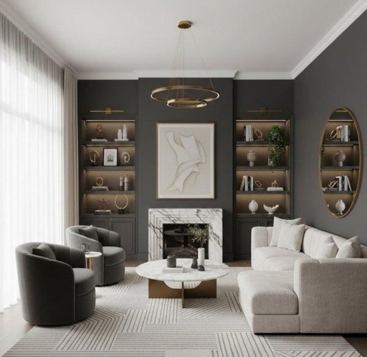
If you want a more dramatic and modern look, charcoal gray and soft ivory are an excellent choice. The contrast creates depth while keeping the overall design balanced.
I find this combination especially appealing in contemporary living rooms and sophisticated bedrooms.
How to use it: Use charcoal gray for a sofa, accent wall, or bed frame. Balance it with ivory curtains, bedding, or a large area rug. Brass lighting can add another layer of elegance.
4. Navy Blue and Champagne
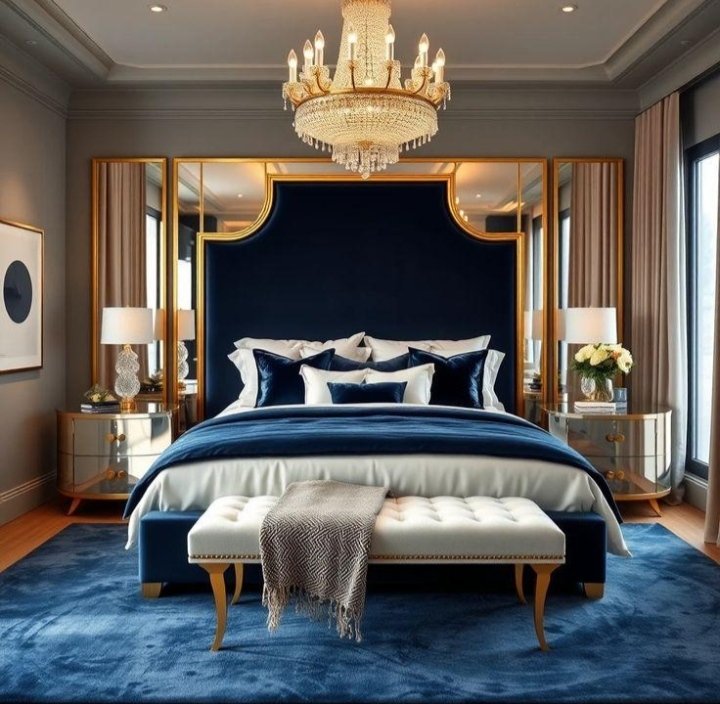
Navy blue instantly adds richness to a room, while champagne tones soften its intensity. Together, they create a luxurious color palette that feels classic rather than overly trendy.
This combination looks especially beautiful in formal living rooms and bedrooms.
How to use it: Pair a navy blue sofa or headboard with champagne-colored curtains, cushions, or decorative accents. Choose warm lighting to bring out the richness of both shades.
5. Terracotta and Cream
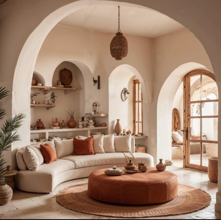
Terracotta brings warmth and character to a space. When combined with cream, it creates an earthy, inviting look that feels effortlessly stylish.
This palette is ideal for homes that embrace Mediterranean, bohemian, or contemporary natural decor.
How to use it: Introduce terracotta through cushions, pottery, rugs, or a painted accent wall. Use cream for larger surfaces to prevent the room from feeling too dark.
6. Chocolate Brown and Soft Beige
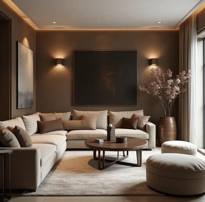
Deep chocolate brown is making a strong statement in interiors because it adds warmth and a sense of richness. Paired with soft beige, it creates a grounded and elegant atmosphere.
This combination is especially beautiful in living rooms and bedrooms.
How to use it: Choose a chocolate brown sofa, wooden furniture, or accent wall. Add beige upholstery, curtains, and textured throws to balance the darker tones.
7. Dusty Rose and Warm Gray
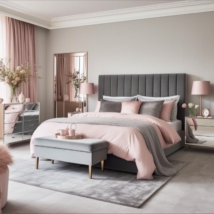
Dusty rose is a muted pink that feels sophisticated rather than overly sweet. Combined with warm gray, it creates a gentle and elegant color scheme.
I particularly like this combination for bedrooms, reading corners, and feminine yet modern interiors.
How to use it: Use dusty rose for cushions, bedding, or a feature wall. Pair it with warm gray furniture and cream accessories for a balanced appearance.
8. Olive Green and Antique Gold
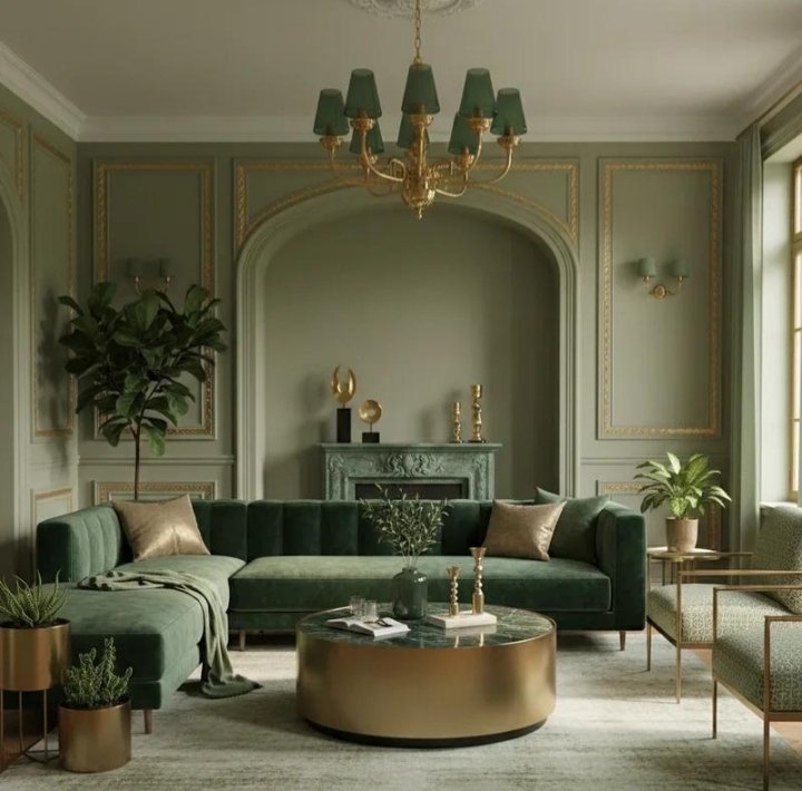
Olive green has a rich, natural quality that can make a room feel more refined. Antique gold adds a subtle touch of glamour without making the space feel flashy.
This combination works beautifully in traditional, vintage, and modern interiors.
How to use it: Add olive green through upholstery, curtains, or cabinetry. Introduce antique gold through picture frames, lamps, cabinet handles, or mirrors.
9. Black and Warm Wood
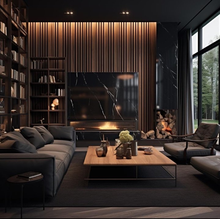
Black and warm wood create a striking combination that feels modern, architectural, and expensive. The dark tones add contrast, while the wood prevents the space from feeling cold.
This palette works especially well in kitchens, dining rooms, and contemporary living spaces.
How to use it: Pair black furniture or accents with walnut, oak, or other warm wood finishes. Keep the walls light and use soft textiles to make the room feel inviting.
10. White and Light Blue

White and light blue create a fresh, airy atmosphere that feels clean and elegant. This combination is particularly effective in rooms with limited natural light or smaller spaces.
It can also give a home a relaxed coastal-inspired look without relying on obvious nautical decor.
How to use it: Use white on the walls and introduce light blue through curtains, bedding, cushions, or accent furniture. Add light wood and simple decorative pieces to complete the look.
How to Make Any Color Combination Look More Expensive
Choosing beautiful colors is only part of the process. The way you use them matters just as much.
Here are a few simple decorating principles I always keep in mind:
- Follow the 60-30-10 rule: Use approximately 60% of your main color, 30% of a secondary color, and 10% of an accent shade.
- Choose fewer colors: Three well-coordinated shades often look more polished than a room filled with competing colors.
- Pay attention to undertones: Warm beige works best with other warm shades, while cooler grays usually pair better with cooler colors.
- Use texture: Linen, velvet, wood, woven materials, and ceramics make a simple color palette feel more interesting.
- Repeat colors throughout the room: Repeating a shade in cushions, artwork, and accessories helps the space feel intentional.
- Consider lighting: A color can look completely different under warm artificial light and natural daylight.
Final Thoughts
Creating an expensive-looking home doesn’t always require a big budget. The right color palette can make your space feel more cohesive, elegant, and thoughtfully designed.
Whether you prefer the warmth of cream and beige, the richness of navy and champagne, or the natural beauty of olive green and gold, the secret is to choose colors that complement one another.
I believe that a well-decorated room should feel beautiful and comfortable at the same time. You don’t need to follow every trend to achieve that.
Which of these color combinations would you love to try in your home?